Muted colors


About
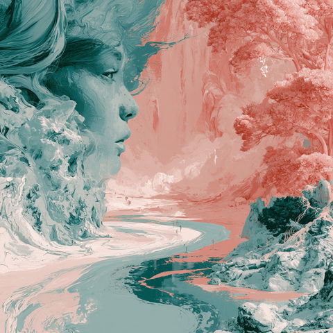
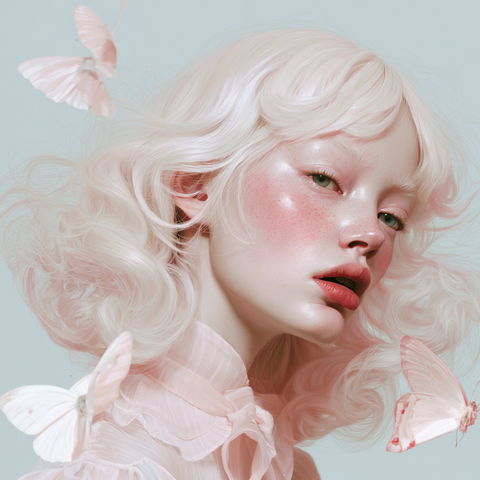
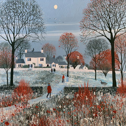
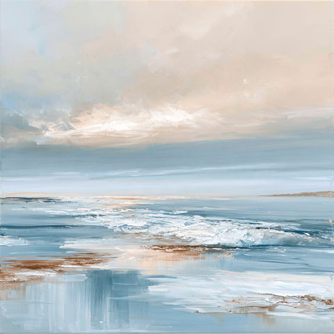
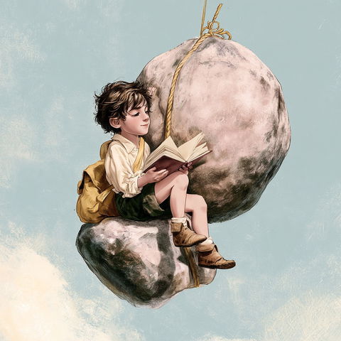
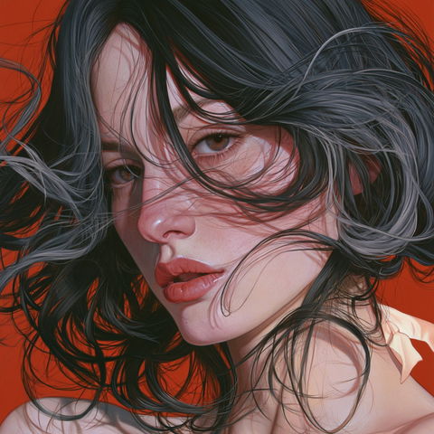
Muted colors is a term often used in art and design to describe a color palette that is less saturated and more subdued. This approach is frequently employed to create a calming and sophisticated aesthetic, often evoking a sense of nostalgia or tranquility. In various art movements, muted colors have been used to convey subtle emotions and to focus attention on form and composition rather than vibrant color.
Observations
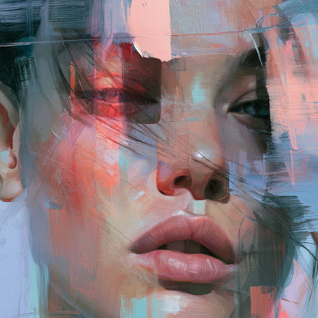
Across all four renders, recognizable portrait forms are built from visible, layered brushwork with scraped and dragged paint, giving the surfaces a tactile impasto quality. Soft pastel pinks, blues, and greens are punctuated by sharper coral and dark accents, while fragmented facial planes and geometric paint blocks create an expressive, slightly surreal collage effect.